The Gutenberg Editor Interface
Trying to find your way around WordPress to publish your content? This guide will introduce you to the different areas of the post editor.
What is Gutenberg?
First released in 2018, Gutenberg is the default page builder and content editor in WordPress. You can use it to publish posts and share your thoughts and theories online without any coding knowledge or skills. The interface is user-friendly, but this quick guide will take you through the key concepts you need to know to get started.
Contents
Introduction to the Gutenberg Interface
To access the Gutenberg Editor, you need to add a new page or post. For this quick overview, we clicked the ![]() button on the main toolbar at the top of the WordPress admin screen to open the post editor.
button on the main toolbar at the top of the WordPress admin screen to open the post editor.
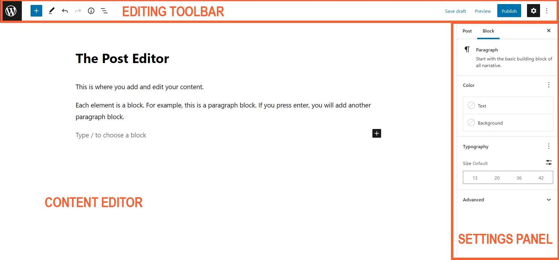
There are three main sections to consider: the editing toolbar at the top of the screen; the settings panel in the sidebar to the right; and the post content editor.

Don’t be daunted by this work area because it’s relatively straightforward to use with a little practice. Let’s start with the content editor.
The Content Editor
Known as the editing canvas, this area is where you add all your blocks to construct a wonderful post that will appeal to your target audience. With Gutenberg, each element in the editor has its own “block” which can styled and modified. There are separate blocks for headings, paragraphs, images, video, tables, widgets and everything else you need to build a post.
The editor provides an effective visual representation of your post as you add more and more blocks, making it easy to track your progress and imagine the final product. In computing and publishing software, this accurate reflection of the finished document is known as WYSIWYG – “what you see is what you get”.
When you open a new post, there should be a blank draft with placeholders for the post title and your first paragraph block. You just need to write your title and start adding blocks.

Add individual blocks
into the content editor
to build your post
Definitions and explanations of each element is beyond the scope of this quick overview of the Gutenberg Editor, but you can find out more in our guide to the text blocks and how to insert media blocks.
The Block Toolbar
It is also important to to note another toolbar will appear when you select a block to edit. This list provides quick access to some of the most common options for that particular block type. For example, you can change the weight of text to bold to italics with the paragraph top toolbar:

The arrows icon ![]() enables you to move the block up or down in the post depending on which one you click. Click and hold the “Drag” icon
enables you to move the block up or down in the post depending on which one you click. Click and hold the “Drag” icon ![]() and you drop the block into another position. There are more options available in the menu at the end of the toolbar, including the “Lock” and “Remove” functions.
and you drop the block into another position. There are more options available in the menu at the end of the toolbar, including the “Lock” and “Remove” functions.
The Settings Panel
Another key area of the Gutenberg Editor is the “Settings Panel”. This sidebar on the right of the screen is where you can change the document settings and make adjustments to each block.
The Post View
Under the “Post” tab, the first section is “Status and visibility”. Here, you can switch the post to public, private and password protected. The first option allows everyone to read the post, but the other two will restrict access to the content.
The post’s slug is in the “Permalink” section. This is the last part of the URL address and directs the browser to a particular post on your website.
If you want to assign the post to categories and tags, you will find the relevant sections in this sidebar.
In our example, we have the “Featured image” section open. This is the primary image connected to your post and is usually displayed on archive pages and recently added lists, so users can get a sense of the article’s content before they click the link.
There are also sections to adjust the values for the “Excerpt” and “Discussion” – the latter is for enabling or disabling comments.

The Block View
The options in the “Block” tab will change to match the block you are editing. For example, if are using the paragraph block, the tab will contain sections to modify the colour and typography of your text. Or the image block will come with options to change its style and dimensions.
Our tutorial on publishing your first post includes a few steps where you can play around with the different values. If you don’t have a local installation of WordPress on your computer or a site hosted on a server, you can always experience the editor by following this link: https://wordpress.org/gutenberg/.
The Toolbar
The main toolbar at the top of the editor contains a handful of options. If are in fullscreen mode, the first icon is the WordPress logo. Clicking the link will take you out of Gutenberg return you to the admin screen. You might see a prompt to save your changes before you leave.
Block Inserter Panel
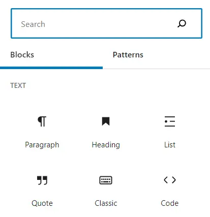
The ![]() button toggles the “Block Inserter Panel” so you can access the full range of blocks and patterns. Start typing the name of the block you would like to add in the search bar and it should appear. Or scroll down to discover what’s available.
button toggles the “Block Inserter Panel” so you can access the full range of blocks and patterns. Start typing the name of the block you would like to add in the search bar and it should appear. Or scroll down to discover what’s available.
Click the icon and name to add the particular block to your post.
A reusable blocks tab will also appear in this panel if you have built your own so they are easier to locate.

Tools
The next button ![]() is for “Tools”. The default mode is “Edit”. You can switch to the “Select” when you want to arrange and rearrange your blocks without modifying their content. It’s a slightly different way you can interact with the blocks and useful for playing around with the flow of your content, especially if you want to reposition a group of blocks to another part of the post.
is for “Tools”. The default mode is “Edit”. You can switch to the “Select” when you want to arrange and rearrange your blocks without modifying their content. It’s a slightly different way you can interact with the blocks and useful for playing around with the flow of your content, especially if you want to reposition a group of blocks to another part of the post.
Undo and Redo
The next two options are to undo or redo an edit. You are probably already familiar with the Ctrl+z shortcut for undo, so continue to use that method if it’s quicker.
Details
The “Details” button opens a popup with a summary of your content, such as the number of words, paragraphs and blocks. Click ![]() to see your own progress – the “Document Outline” is quite useful for long-form content.
to see your own progress – the “Document Outline” is quite useful for long-form content.
List View
The “List View” shows you an outline of the blocks currently added to the post. This is really useful in more complex groups and patterns where blocks are nested inside other blocks. Click on an element to jump to that block in the main editing area.
The Blank Space
Developers are creating new blocks and features all the time for the Gutenberg Editor and making theme available in plugins and widgets. They might integrate a button or menu to access their enhancements and extensions in the blank space between the options we have already defined and the group of buttons to the right of the screen.
You might have a few more options on your screen depending on your theme or the plugins you have installed to your WordPress site.
Save Draft, Preview and Publish
The next three options are self-explanatory.
Remember to save your progress because accidents are inevitable. “Preview” is quite useful because you will be able to see what your post looks like when someone visits your site on a desktop, tablet or mobile device; it is worth checking how your layout responds to different viewport sizes. When you are satisfied with your work, press the “Publish” button to go live.
Customising the Interface
The last button in the toolbar is for “Options”. This icon ![]() is commonly known as a kebab menu. Click it to access a range of options to customise the Gutenberg interface. Again, the different values are beyond the scope of this overview, but we do have another guide to customising the Gutenberg Editor screen if you would like to know more about modifying the interface to improve your workflow.
is commonly known as a kebab menu. Click it to access a range of options to customise the Gutenberg interface. Again, the different values are beyond the scope of this overview, but we do have another guide to customising the Gutenberg Editor screen if you would like to know more about modifying the interface to improve your workflow.
Final Thoughts
Named after the printing press that revolutionised the manufacturing of books, the Gutenberg Block Editor aims to make publishing content online easy for everyone. Hopefully, our quick look at the different areas of the interface has help you to become more familiar with the software so you start your own revolution.
If you have found some of the terminology confusing, you can always search for definitions of the key concepts in our WordPress glossary. It is a useful resource to reinforce your understanding of WordPress.


