Magazine Cover Analysis
A guide to the codes and conventions of this important media form.
Introduction
Magazines remain a key part of the media landscape. Some specialist publications target a niche audience while others are more mainstream and appeal to a range of ages and interests. With such a competitive market, a combination of a strong image or concept with snippets of stories is required to grab the audience’s attention. This guide will walk you through the codes and conventions of magazine covers.
Contents
Worksheet
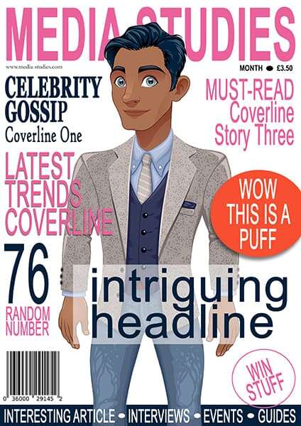
If you would like to annotate your own copy of the front cover, you can download the worksheet. You can also view a larger version of the page by right-clicking on the image and opening it in a new window.

Masthead
In publishing, the masthead refers to the title of the magazine. Printed in large type, it is usually positioned at the top of the page and fills the width of the cover. These factors ensure the brand is instantly recognisable.
The choice of colour and font weight will connect to the genre and ideology of the magazine. Consider the difference between the rough display type of “Kerrang” compared to the elegance of “Brides” magazine:


Although the colour of the title will change according to the particular needs of the issue, the black and grungy title here connotes a rebellious quality, and the use of bold weighting and capital letters conveys confidence. These meanings will resonate with the psychographic profile of the target audience. The lack of space between the letters, known as kerning, makes title visually appealing because we are not distracted by empty spaces. The word kerrang is defined as a power chord struck on the guitar. In some ways, the presentation of the title echoes this meaning.
“Kerrang’s” nameplate is set in a modern typeface called Druk Condensed Super Italic. This sans-serif font is much brasher than the graceful serif of the Eldorado Relay typeface used by “Brides”. Again, the colour of the masthead will change to match the palette of each issue, but this magazine tends to use gold, pink and white quite regularly because of their associations with femininity and luxury. The capital letters look self-assured and ensure the title is the centre of attention.
If you look closely, you can see manual kerning has been employed so the space between each letter is tight but appropriate. Zoom in and spot the difference between “B” and “R” compared to “I” and “D”. This variation ensures the title is as big as possible on the cover but remains legible to the reader.
More generally, if the publication is well-known, the masthead might be obscured by the main image. This layering effect a nice design feature and is aesthetically pleasing.
In conclusion, the masthead should establish the brand and its values. This can be achieved through the choice of font and position on the cover. These two examples certainly encode a clear message to the audience.
Cover Image
Celebrity sells. Many publications note a sharp increase in revenue when the most famous faces dominate the cover. Music magazines will splash an image of a popular band or artist on the front page, while the main actor from the latest blockbuster will no doubt help sell a film magazine.
Invariably, the direct gaze of the person will pierce the viewer and a medium shot or close-up will connect us to the emotional energy of the glamorous model or star. Other non-verbal codes will help support the magazine’s values and message, such as how a smiling bride or the powerful stance of a sports star encode the right meaning for the target audience.
To achieve the most appropriate representation, the mise-en-scène needs to be controlled so expect the main image to be taken from a studio photoshoot. High key lighting is used in fashion magazines to the keep the image fresh and youthful.
Of course, the main image will be directly related to the lead article.
Featured Article
Magazines are full of news reviews, interviews, opinion pieces, exposes, and behind the scenes stories. However, a feature is a longer piece of writing which covers an issue in greater depth than a normal report. The lead article will also be some sort of exclusive with the broadest appeal to the readership.
To give the story prominence, the designers will use large lettering and position the words in a contrasting colour to the background image. In our mock-up, the headline is a similar blue to the character’s clothes, so an opaque box was added to help make it stand out to the reader.
Coverlines
Other important stories are floated along the sides of the cover. Bold and italics will emphasise the text. No matter if they are human interest stories, celebrity gossip, or a profile of a famous politician, short and catchy buzzwords are used to tease the reader into buying the magazine. Enigma codes are also very engaging because they encourage to reader to find out more. Of course, the mode of address will vary depending on the publication, especially if the readers expect the language to be formal or informal.
There might also be a colour connection between the clothing worn by the cover actor and the font choice. In the mock-up, coverline one matches the blue outfit of the character. For the other stories, blue and pink are appealing contrasting colours.
If you are designing your own magazine cover for your coursework, remember it is really difficult to make the headlines stand out if they are placed on a pattern or mixed-coloured background.
Puffs, Plugs and Boxouts
If you do have a multicoloured background with very few areas of high contrast between light and shade, boxouts provide a great way to get your ideas across to the audience. They are simply coloured squares or rectangles positioned beneath the text to help the words stand out.
Another common convention of magazine covers is puffs. These eye-catching graphics are used to draw attention to the text. Instead of a square, the puff in our example is a circle and is conveniently identified by the words “Wow” and “This is a puff”. Importantly, a drop shadow has been used to create a sticker effect which is very popular with designers.
A strong outline, such as the one used for the “Win Stuff”, or a star shape are often used to plug a competition or some other incentive to purchase the magazine.
Strips and Banners
Look at the bottom of our mock-up and you will see a blue strip running across the cover and containing a list of items. These strips usually include information about more minor articles and regular features inside the magazine.
A banner is a larger version of this approach.
Price, Issue and Sell Lines
Magazines should include the date, issue, price and barcode on the cover. If you are creating your own cover, remember to add these details.


