Newspaper Front Page Analysis
A glossary of key terms to develop your awareness of this media form.
Introduction
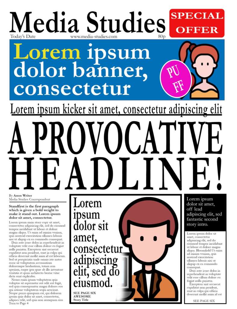
Newspapers and magazines remain an important part of the media landscape. Their codes and conventions are well-established, and readers expect to see those forms and styles, even in digital versions of the text. You should already be familiar with lots of print media terms from the previous guide which looked at the typical features of a two-page spread. Using our own mock-up, we are going to explore the most important concepts when it comes to designing a front page.
Contents
Worksheet
If you would like to annotate your own copy of the front page, you can download the worksheet. You can also view a larger version of the page by right-clicking on the image and opening it in a new window.

Masthead
The name of the publication can usually be found fixed at the top of the front cover. The more traditional broadsheets would have black and bold letters designed to grab the reader’s attention and reinforce the brand. It is no surprise that magazines position themselves as the modern alternative by having sleeker and more colourful titles.
The masthead can just be the name of the paper, but it can also include printing details, the names of the staff who worked on the edition or some contact information.
It is also important to note that many magazines place part of the title behind the face on the front cover.
Ears
The spaces either side of the masthead are known as the ears. In our example, we included a promotional offer to entice the reader to buy the paper. Publishers, such as the tabloid press, might use the space to advertise their sport content or competitions that might interest their readers. Broadsheets sometimes use the ears to identify that this is a special edition of the paper.
Splash
The lead story on the front cover is known as the splash. Since the editors are trying to grab the reader’s attention, they hope the most important story of the day will “make a splash”! In our worked example, the splash is the left column and it is given more prominence by the large headline above the copy.
Standfirst
You will notice that the first paragraph of our lead story is in bold and the text is larger. Even the first word is capitalised. This helps direct our focus to the start of the article. This style, and its variations, is called the standfirst. The introductory paragraph should maintain the interest established by the headline.
Off Lead
The second most important story is called the off lead. In our example, it is probably the column on the right. It stands out because of the black background applied to the long title and it is positioned inside a black frame.
Frame
When a story is enclosed within some sort of border, such as the black outline around both the off lead and the article in the middle, it is said to have a frame. This border helps to differentiate the article from the other pieces on the page.
Caption
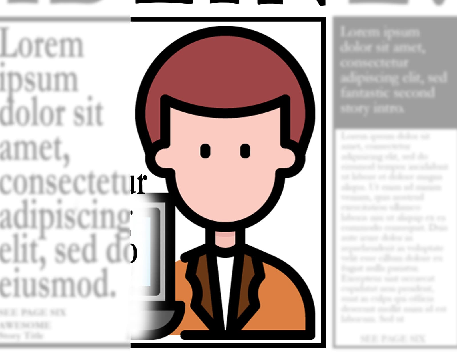
The article in the middle stands out because of the black border around the story, its large headline and, of course, the accompanying image. If you look closely at the bottom-left of the box, you might notice a little caption. This provides anchorage to help deliver the preferred reading of the image.
Banner
Stretching across the width of the page, the section with the blue background is obviously a banner. Papers use this space to advertise their special report or weekly supplement. Again, there might be a promotional offer or a chance to win a luxury holiday.
Puff
A puff is another incentive to buy the newspaper or magazine. It is normally inside a colourful but simple circle or rectangle. In our example, there is a basic white stroke around the edge to distinguish the puff from the blue banner.


