Print Media Advertising
A guide to images, headlines, slogans and branding in print media advertising.
Introduction
Companies and corporations always want to raise awareness of their brands and ideologies, but their messages need to be appealing and relevant if they are going to engage the target audience effectively. Of course, a lot of their marketing budgets are being spent online, with Facebook and Google dominating the digital ad space. However, here are three reasons why print media advertising continues to be a crucial marketing tool:
- Publications, such as newspapers and magazines, have a tremendous amount of data regarding their readership. Advertising agencies can use that demographic and psychographic information to reach their target audience, placing the product in front of the people who are most likely to make a purchase, especially if it is a niche market.
- Perhaps this is why research suggests readers are more engaged with printed material in magazines compared to digital platforms. How quickly do you scroll down a webpage and then move onto the next site? Did you even see the advertisement? Print media is still considered to be credible so audiences are more likely to pay attention to the message.
- The style and design of the advertisement is easy to adapt. For example, advertisers can use leaflet drops and site-specific promotions, including bus stations and train stops, to promote the products or services.
If you are revising for a media studies exam or you have to develop your own cross-media product, this guide will introduce you the key codes and conventions of print advertising.
Contents
The Main Image
One of the best ways to communicate a message is through the tremendous power of images. A great shot of the product might be enough to entice viewers, but lots of advertisements sell a lifestyle by appealing to our aspirations. Illustrations are a friendly and playful way to show the benefits of using an item and infographics can make statistics colourful and accessible. If they are carefully constructed, pictures have the ability to tell a compelling story and evoke an emotional response from the audience.
To deliver the producer’s preferred reading of the text, the representation needs to be just right.
Setting and lighting help create a suitable atmosphere and tone. Non-verbal communication, such as body language and facial expression, is a quick and simple way to communicate the mood because the audience will easily decode and understand the meaning behind those codes. The technical codes, such as framing, depth of focus and lighting, will also have to be appropriate.
Holiday Advertisement Example
Look at the following advertisement and how it uses visual codes to sell holidays to a UK audience desperate for a summer escape:

To the target audience, the palm trees are an obvious signifier of a foreign destination and its warmer climate. This is reinforced by the denotations of the flawless blue sky and the tranquil sea in the background. Put simply, it looks fantastic and the couple are clearly enjoying their holiday.
Both actors seem relaxed, especially the man’s worry-free body language, floating in the pool with his elbows causally propped on the edge. Notice how the woman is wearing a red swimsuit. This colour code connects her to the brand’s colour scheme. It is picked up again the letter “U”, emphasising that this is “your” chance to get away from the stresses of everyday life. Finally, the red symbol is supposed to depict a smiling face because the holiday company’s aim is to make you happy.
The London Dungeon Example
In contrast to the bright optimism of the holiday advertisement, the following poster is much darker and appeals to our desire to experience a thrilling sort of terror.
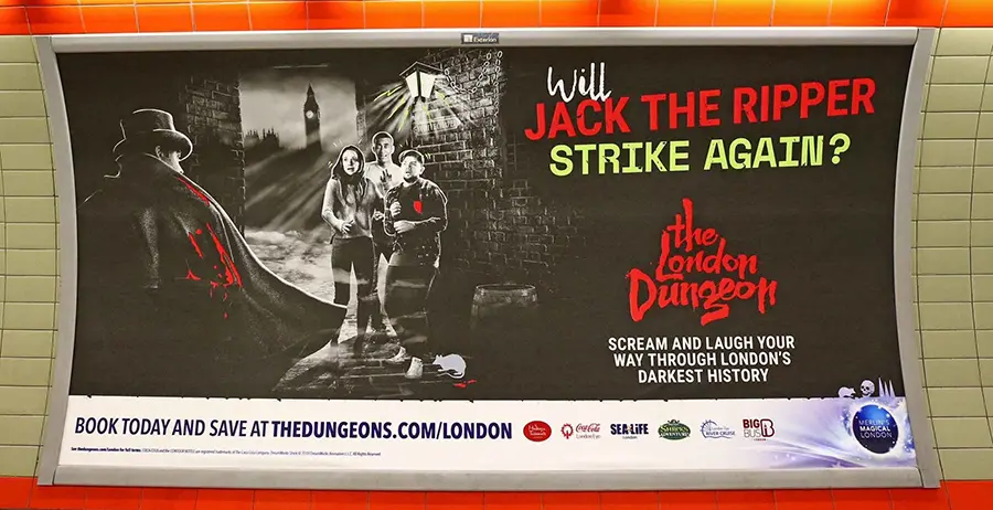
As previously mentioned, print media is very good at targeting audiences in terms of their geography so it is no surprise this advertisement for The London Dungeon appeared in the London Underground. The location of the attraction is reinforced by the signifier of the famous clock tower in the background. The three frightened characters suggests the target audience is a younger demographic than the previous advertisement but, this time, red connotes danger and violence. There is no doubt the macabre image is very “striking” and will grab the audience’s attention.
In conclusion, images can deliver a great sales pitch and generate excitement for a product that is why advertisers try to make their stories look convincing and irresistible.
Advertisers Tricks
Pictures speak a thousand words. However, those words are not always truthful or accurate. Have a look at this fantastic (and slightly disturbing) video from Facts First to see some of the tricks photographers use to present products:
The Headline
In print advertising, the headline is the phrase or sentence that attracts our attention to the product or service. In the previous examples, the headlines were the imperatives “Rejuvenate” and “Will Jack the Ripper Strike Again”, which both posed a question to the audience. Many advertisements use this sort of direct address to appeal to the audience. Others will make promises or offer a challenge.
The Typeface
Effective headlines are brief, but the choice of typeface and font are crucial to its success. A simple sans serif typeface conveys a modern and friendly tone. They are also confident and direct. By contrast, an elegant serif typeface suggests the brand is traditional and trustworthy. Look at the difference between the following two insurance companies and try to work out which one is aimed at an older demographic:

Font weight can also be used to encode meaning. Topshop was an iconic fashion retailer in the UK known for its trendy, high-street clothing but now the brand is only available online through ASOS. Take a look at the following logos:

The typeface is the same, but Topshop is light the version and Topman is bold. What does the different font weight suggest about gender identities?
As we have already seen, font colour can also influence our interpretation of the product. Red can imply both danger and passion. The choice of colour should support the advertisement’s message.
The Slogan and Copy
Slogan is Irish for “war cry”. Advertisers are going to battle for your attention and a catchy phrase is their rallying call. Effective slogans will be memorable, reinforce the brand identity, and separate the company from their competitors. You know Carlsberg is probably the best lager in the world and maybe she was born with it. If you need to create your own slogan, just do it.
The other copy on the advertisement might describe how the service or product meets the needs of the consumer. Although the language should be simple and direct, the tone of the copy will remain helpful and friendly.
Again, choices have to be made regarding the typeface and font. If the main image is particularly colourful, the copy might be placed on a plain-coloured box so there is enough contrast to read the words.
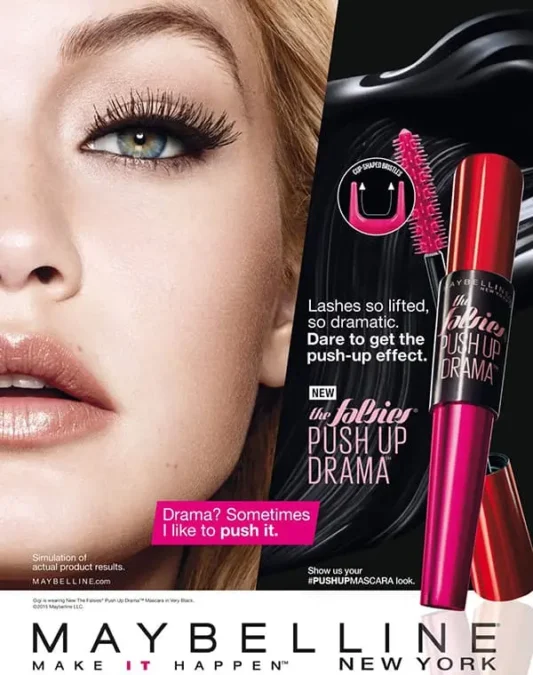
In this example form Maybelline, the signature and slogan are situated on a simple white rectangle for maximum visibility and there is an effective subheading on a pink puff. The mixture of typeface and font for the other copy on the right makes the writing accessible. There is some technical information but the font size is small so it does not distract from their key selling points.
Branding
Branding is an attempt by businesses to communicate their values and character. Regardless of the quality of their product, there is always intense competition in the marketplace and branding can be a deciding factor when consumers determine which option to pick off the shelves or click to buy.
The name of the company and their logo will certainly be visible on the advertisement.
Conclusion
Print media advertising remains an effective way for business to communicate with their target audience. If the marketing agents can combine the right image with the right words, then they will certainly attract our interest. It is important to note that some advertisements are hoping for an immediate impact, particularly if it is a limited offer. However, a lot of marketing campaigns are simply designed to maintain brand recognition in the hope you might purchase their product six months later.
