Rule of Thirds in Photography
Improve the quality of your compositions with our introduction to this important concept in photography.
Introduction
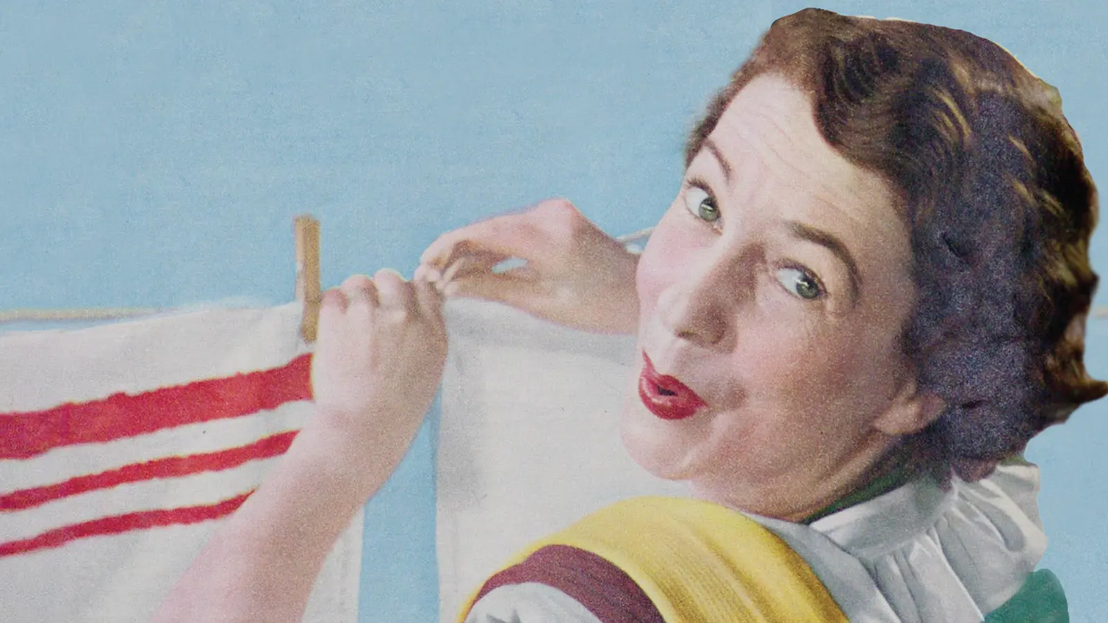
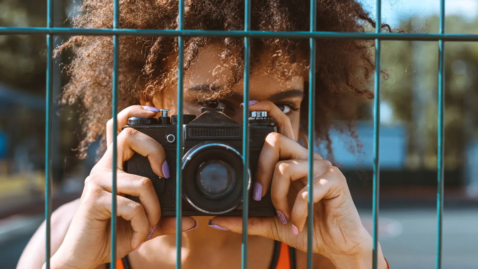
Many students will simply aim their camera directly at a person or object and stick them in the centre of the image. Scroll through the pictures of your friends and family you have on your phone. How many times do they appear in the middle of the composition or completely dominate the shot? This might be fine to a record a night out and a fun event, but it will not help you achieve the top grade in media studies.
Instead of having your subject in the middle of your screen or lens, try placing the most important elements off-centre because that natural look will be pleasing to the eye. If you want to make the composition of your photographs more appealling, you should follow the rule of thirds.
Contents
Rule of Thirds
The rule of thirds divides the image into a grid of nine spaces with the key elements positioned along these lines or where the lines intersect. For example, in the image below, the crest of the hill is along the bottom third and the dark tree is positioned on a power point where two lines cross:
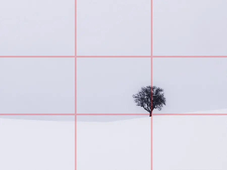
Notice how the blank sky occupies the top two-thirds of the photograph and the snow-covered land takes up the bottom third. One third of the image is to the right of the tree while the other two-thirds are to the left. There is a sense of balance in the composition because the key elements are distributed effectively.
If you line up the most interesting parts of your own landscape photograph with these points, you will capture a visually appealing image. The same rule should also work for cityscapes.
In the next example, a close up of a model wearing sunglasses, we can still apply the rule of thirds. The subject is positioned right-of-centre, so her glasses occupy an important crossing point. Her hat is being pulled in such a way the curve begins at the top of the second vertical and then runs along the bottom horizontal line. Even the raised finger seems to acknowledge the rule of thirds.

Make sure you are drawing the viewer’s eyes to the important signifiers by positioning them on these lines and intersections. It should also create a subtle balance between the subject and negative space.
Smartphone Gridlines
Most smartphones give you the option to overlay gridlines on your screen to help you compose the shot effectively. If you have an iPhone, go to Settings ![]() and scroll down to Camera
and scroll down to Camera ![]() . You will find the Grid in the Composition section. Toggle it on to activate the gridlines.
. You will find the Grid in the Composition section. Toggle it on to activate the gridlines.
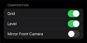
When you open your camera app, you will see the horizontal and vertical lines.
On an Android device, such as a Samsung phone, launch the Camera app ![]() and tap Settings on the top left side of the screen. Scroll down to Grid Lines. Toggle it on to activate the gridlines. You are good to go.
and tap Settings on the top left side of the screen. Scroll down to Grid Lines. Toggle it on to activate the gridlines. You are good to go.
DSLR cameras will also have a grid function, so make sure you turn on the guidelines and get used to the rule of thirds.
Cropping an Image
The gridlines appear when you edit your images as well. Drag the image or one of the corners to position your focal points on the lines or intersections.

Of course, you should rework the image in more appropriate editing software, such as Photoshop, rather than on your phone.
Examples from the Media
The box art for the PS4 and Xbox One editions of Red Dead Redemption II is a good illustration of the rule of thirds. The cover depicts the protagonist, Arthur Morgan, behind silhouettes of the Van der Linde gang members riding on their horses. Although these key signifiers are centred to emphasise their importance in the narrative, the landscape follows the photography rule with the rough terrain running along the bottom horizontal, the trees in the middle and the sun rising into the top third.
Balancing the weight of each part of the background ensures our attention is focused on the protagonist and his enemies while still reinforcing the Western genre. It is a compelling advertisement.

Consider the layout of the UK quad poster for Tomorrow Never Dies (1997):

Pierce Brosan’s face is centred where the first horizontal and first vertical lines intersect. This dominant position helps reinforce the confidence and power encoded in the direct mode of address. The first vertical line also splits the title the very effectively. The second vertical is occupied by the actor’s hand and his weapon.
It is worth mentioning how the white collar of his shirt seems to sweep down to meet the cuff. This curve echoes the background. Overall, it is a wonderfully balanced composition.
Our third and final example is Beyoncé’s album cover for Dangerously in Love which was released in 2003:

Negative Space
Look again at the three examples. By moving the subject away from the centre and creating negative space in the lower third, the producers were able to integrate the title of the texts into the composition. Remember, you are taking a photograph that will be combined with other elements to construct a message that will interest the audience.
Conclusion
Since most cameras come with a grid function, you have no excuse for simply snapping pictures of your friends and family for your coursework and ignoring crucial aspects of the composition. When you are getting ready to take your photograph, divide the screen into thirds and position the key focal elements along these lines and intersections.
An obvious exception to this rule is when you divide the shot in two to achieve symmetry in the image.
Finally, remember to check the resolution of your images on your camera and editing software.