Oh Comely Magazine
Analysis of the legacy media product, including genre and representation.
Introduction
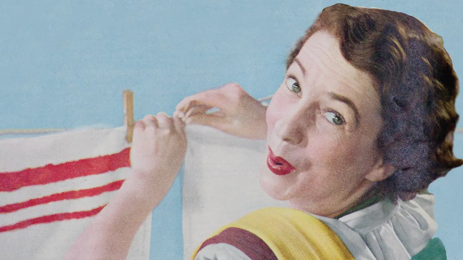
Launched in 2010, “Oh Comely” was published by the “proudly independent” Iceberg Press. According to their website, it was a “mindful magazine with a fresh perspective”. Each issue was available to purchase for £5 in a few newsagents, independent retailers, cafes and museums. There was also a subscription service available – £14 for six months (3 issues).
In 2019, the magazine was rebranded:
Oh is a reimagination of Oh Comely magazine and is still a place to meet new people, hear their stories and hopefully leave you looking at life a little differently. And every issue will still have beautiful photography and illustration at its heart
Based in London and aimed at a niche audience, the alternative magazine offered “deliciously long and transporting reads”. The publishers wanted to “celebrate the humble, the frugal and the plentiful; the magic in the mundane, and the unsung beauty of the unnoticed”. This is obviously in contrast to the quick and easy reads found in glossy lifestyle magazines – you might be interested in reading our guide to the close study product “Men’s Health” to see the difference.
Sadly, the magazine was impacted by the pandemic and the final issue was published in September 2021.

Focusing on media industries and media audiences, we are going to begin with a definition of the target audience and then our analysis of the front cover will tease out some of the key aspects of the text.
Contents
“Oh Comely” Target Audience
Have you heard of the expression “just the tip of the iceberg”? Floating freely in open water, icebergs come in all shapes and sizes. As the publishers like to point out, “a whole world lies beneath” the surface of the water. In this way, the image of an iceberg is a great analogy for the confident, creative and carefree women “Oh Comely” represented.
With its “intelligent and interesting voice”, the magazine targeted affluent young women who wanted a “stylishly presented” alternative to the cheap aesthetic of mainstream magazines. The average age of the reader was 27. In terms of psychographics, they desire culture and authentic experiences, and they are prepared to “spend money on the things they love” because they genuinely care about the brands they buy. This was reflected in the advertisements which often promoted independent shops rather than large conglomerates.
The target audience will be able to identify with the cover star from this particular issue because she fits the millennial demographic profile and is certainly stylish.
Decoding Positions
The audience’s reaction to “Oh Comely” will depend on their frameworks of knowledge. In his reception theory, Stuart Hall identified three decoding positions and used them to describe the range of possible interpretations to a text. The target audience will appreciate the magazine’s liberal views, rejection of mass consumerism, and focus on culture. This is the preferred reading.
In terms of the uses and gratifications theory, the magazine might appeal to the reader’s personal identity because the content reinforces their values and beliefs. Of course, the articles about fashion and music can help the audience to construct their identity as suggested by David Gauntlett.
However, some women might reject the magazine’s message and its minimalist aesthetic as pretentious. This is the oppositional reading of the text. In their review of feminist discourse, Judith Butler argued against their assumption that “the term woman denotes a common identity”. The middle-class lifestyles and preoccupations depicted in “Oh Comely” might be irrelevant to women on a low income or do not have the same level of independence as other readers. The feminist critic, bell hooks, emphasised the need to consider the intersection of race, gender and social class when we critically assess representations.
The Front Cover and Representation

Traditionally, magazines competed against each other on the shelves to grab our attention. With a subscription-based business model, “Oh Comely” was not trying to appeal to these impulse buyers in the supermarkets, so they could go for a different aesthetic.
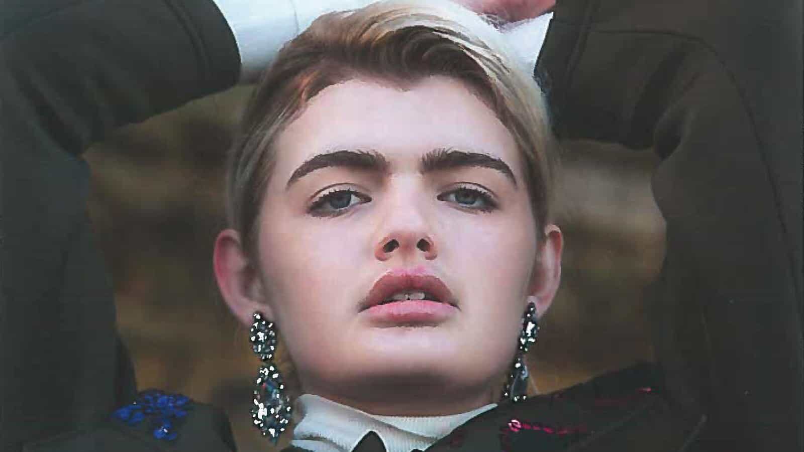
The Model
The dominant signifier is obviously the fashion model. Medium shots tend to direct our attention towards the person’s thoughts and feelings rather than their body or movement. In terms of non-verbal codes, there is a sense of “strength” and “mischief” in her pose and facial expression. Her gaze is pointed directly back at the viewer – empowered rather than objectified.
Although the choice of clothing and other aspects of model’s style could be decoded as androgynous, her “power and poise” is really open to interpretation.
The Masthead
The adjective “comely” means attractive and pleasing, but it also denotes sophistication and conformity. The title of the magazine, therefore, seems to be a celebration feminine beauty without reducing women to objects used to satisfy the male gaze.
Normally, we use the interjection “oh” to express our emotions – the word connects with the publisher’s ambition to tell “stories”. Interestingly, in poetry and drama, the word “oh” was also used to address an abstract idea or person. This figure of speech is known as the poetic apostrophe and its use in the title emphasises the magazine’s appeal to creativity.
The magazine title occupies the negative space above the model. The display type looks handwritten giving the title a more personal or intimate touch. It should also be noted the use of lowercase letters could be rejection of patriarchy – bell hooks is a good example of this choice.
Coverlines
Three coverlines are positioned at the bottom of the page. In terms of narrative structure, they are enigma codes because they reveal very little about the articles inside. It’s only when the reader reaches page 6, for example, do we learn the “hard-won wisdom” is a section where “four writers share personal stories of the defining moments that gave them a fresh perspective”.

Finally, look at some of the lexical codes used in the coverlines: “wisdom”, “power”, “strength” and “hard-won”. In her analysis of feminist discourse, Liesbet van Zoonen said masculinity was often associated with “rationality”, “individualism” and “competition”. The magazine is deliberately re-coding these masculine characteristics as feminine. Female empowerment is a major theme of the publication.
Speaking Out
You are expected to study two articles from the magazine. The first, “Speaking Out”, introduces five women and their fantastic contributions to important issues that impact women, from raising awareness of FGM to getting more girls involved with computing and coding.
The article begins with the conventional combination of a headline, kicker and byline. The elements are differentiated by a few simple typographical choices: the headline has the largest font, the two-deck kicker is italicised, and the typeface for the byline is sans serif. They are centre-aligned and occupy the top third of an otherwise blank page.
This clean and clear minimalism is typical of magazine’s aesthetic.
The introduction is on the verso, or left page, so it is visually connected to the recto, or right page, and the first profile:

Each profile follows the same layout and design, consisting of a colourful head shot with the quote, name, occupation, main copy, and social media handle underneath. The images try to reveal each individual’s strengths and personality. For instance, Fahma Mohamed’s hijab and denim jacket signifies her youthful exuberance whereas the Amali De Alwis’ portrait suggests a more business-like tone.
Their quotations are inspirational. Their stories are compelling. Their ambitions are amazing and epitomise the theme of the issue: “strength”. For example, at the age of thirteen, Meltem Avcil was “thrown into a caged van” and taken to a detention center for asylum seekers. She was “robbed of all autonomy and deprived of her basic rights”. From behind those bars, she successfully campaigned to end the detention of children seeking asylum in the UK.
Group Discussion
We know representation is important and it is obvious the publishers are trying to celebrate the diversity of women’s experiences and their achievements. Your task is to compare and contrast how each woman is represented. For each image, you should consider the mise-en-scène, how the non-verbal codes and dress codes signify their personalities, and the use of technical codes such as lighting and framing.
Explore how the quotations cultivate a sense of defiance and self-determination.
Read each profile and, using narrative theories, analyse how the messages are encoded. Our guides to Tzvetan Todorov’s theory of equilibrium and Vladamir Propp’s character types can help. You should also consider the mode of address?
Does the minimalist aesthetic help to keep the focus on their stories. Do they “inspire” you to find “your own revolution”?
If you want to keep track of your ideas and feelings, you could should scribble them down on a page or complete a simple table:

More than Gender
It is a truth universally acknowledged that broadcast media reinforced the dominant ideology when it came to gender identities. In her review of feminist discourse, Liesbet van Zoonen noted the debates also often viewed gender as binary: masculinity was “political and rational” whereas femininity was “emotional and inclined to nurture”.
With her concept of performativity, Judith Butler argued gender identities were not fixed because “gender is manufactured through a sustained set of acts”. They believed representations which transgressed the old binary caused gender trouble but were also evidence that gender was a construct rather than stable and universal truth.
The second article you need to analyse in detail is “More than Gender”. As the kicker suggests, it is a story about “shifting identity”. Andrea Allan leads the conversation with her sibling, Ash Allan, and provides the images which accompany the article.

Analyse the Article
The following table contains the important signs from the article. Your job is to analyse each element in detail and then consider what values and attitudes are being encoded by this combination of signs. Finally, explain how this representation would appeal to the target audience?
| Signifier | Signified |
| lexical codes on page 101: “More than gender” and “shifting identity” | |
| Byline and photo credit | The story is in their own words. Self-representation is an important theme in the article. |
| Image on page 101 | |
| Main Copy: the structure and content | |
| Layout of the main copy: columns are left-aligned with ragged-right edge and clear alleys | |
| Images of the siblings | Andrea and Ash appear in separate images. This reinforces the idea of their individual identities. The eyeline match connotes their affection and respect for each other. Ash is depicted in “masculine mode” which points to his recent gender “evolution”. |
| Images of the roads winding through the woods | The images of the roads turning in the woods connects to the “neutral space” where the siblings were able to talk openly to each other. The road refers to their journeys around Newcastle, but it also connotes how Ash “forged a new identity” without knowing where his choices would lead. There is also the interesting juxtaposition between the natural world, signified by the trees, and how society constructs identity, suggested by the road and its markings. Is there a tension between the two? |
| Photo booth images | |
| The biographical details on page 105 | |
| The overall layout of the pages |
Essay-style Questions
- Referring to the Close Study Product “Oh Comely”, Explain how media language in magazines incorporates values and ideologies.
- Ideology can be defined as a collection of values and beliefs. Referring to the Close Study Product “Oh Comely”, to what extent can media text challenge dominant ideologies?
- Evaluate the usefulness of bell hooks’ concept of intersectionality in understanding the representations in the Close Study Product “Oh Comely”.
- Referring to the Close Study Product “Oh Comely”, to what extent do you agree with Judith Butler’s concept of performativity and her description of gender identity being “instituted through a stylized repetition of acts”?
- David Gauntlett suggests media texts help audience construct their identity. Referring to the Close Study Product “Oh Comely”, to what extent do you agree with his ideas?
- Stuart Hall suggested products are decoded in a specific way by the audience. How useful is reception theory in analysing the Close Study Product “Oh Comely”?
- Explain how representations of gender within “Oh Comely” reflect its social and cultural context.
- New digital technologies continue to revolutionise how audiences consume media texts. To what extent are print magazines still relevant to the audience? You should refer to the Close Study Product “Oh Comely” to support your answer.
- Explain how economic contexts affected the distribution of the Close Study Product “Oh Comely”.