Injecting Fear into the Mass Audience
The best way to learn about media effects theories is to apply the framework to a variety of texts.
Introduction
The hypodermic needle theory suggests the audience are passive consumers of the media and producers can have an immediate and uniform influence on our values and patterns of behaviour. This model of communication was first described by Harold Lasswell who compared the propaganda posters of the First World War to a serum being injected into the public’s mind to convince them to fight for their country.
Most critics dismiss this process because audiences are active consumers of the media. For example, Stuart Hall argued everyone decodes broadcasts according to their own framework of knowledge, even taking an oppositional reading when they rejected the message.
However, media producers are still trying to coax and flatter the audience. We are going to focus with the language of fear-based advertising to explore the relationship between the producer and mass audience.
Contents
“Eyes” Safety Campaign
Drink-driving campaigns have been a regular feature on television in the UK since the first one aired in 1964. They are often gruesome and distressing because the creators want to emphasise the terrible consequences of this unacceptable behaviour and encourage drivers to take responsibility for their actions.
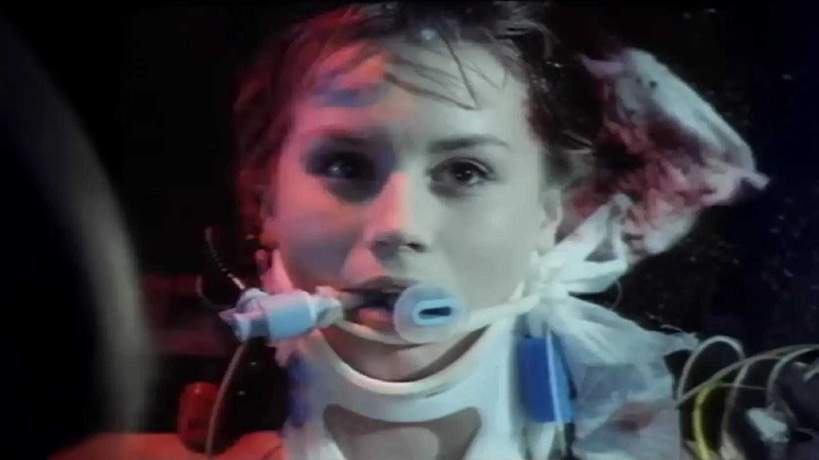
This particularly disturbing campaign is from 1992 and is called “Eyes”.
The dominant signifier is the pale face of the young girl. Her ghostly appearance should grab the attention of the viewer. The plastic tubes, neck brace and the use of the defibrillator signifies the seriousness of the medical emergency. Blood is used sparingly in the image, but there is some soaking on the bandage behind her head and a line running from her nose. Even the use of a canted camera angle makes the viewer feel uneasy.

Roland Barthes suggested a photograph could elicit strong emotions from the viewer. He called the signifier which produced this response the punctum. The way the girl stares lifelessly at the camera certainly pierces the viewer.
Consider the direct mode of the address in headline: “look her in the eye”. The combination of elements demands an immediate reaction from the audience. The tagline anchors our interpretation of the text: “Drinking and Driving Wrecks Lives”.
Does the television version also have a direct and powerful impact on the viewer?
The producers behind the “Eyes” campaign hoped their shock tactics would result in a reduction of alcohol-related crashes and the number of people driving under the influence of alcohol. The target audience will surely appreciate the preferred reading of the message – don’t drink and drive. Although there is some evidence pointing to the success of these safety campaigns around the world, the statistics are not conclusive.
If the media cannot inject a message into the audience, even when using incredibly shocking imagery, it can still define what values are important and deliver a gradual shift in our beliefs and behaviour. This is known as the agenda-setting function of mass media, and it is why safety campaigns continue to be circulated in the media.
Lipstick Advertisement
In her analysis of the beauty industry, Naomi Wolff argued women were being brainwashed into believing they had to buy expensive creams and serums to keep their skin looking youthful and achieve unrealistic beauty standards. She called this obsession the beauty myth. Making women feel a relentless pressure to conform to narrow representations is a good example of media producers using fear and guilt to inject cultural values into the audience.
The following advertisement is for Dior’s Addict lipstick range.
The dominant signifier is Jennifer Lawrence. Celebrity endorsement is an effective line of appeal because the target audience are already familiar with the actress and will immediately connect with the text. In terms of the two-step flow theory, she is an opinion leader who is a trusted authority on glamour, so her opinion followers are more likely to buy into the Dior brand.

Once again, the mode of address is direct with Jennifer Lawrence gazing at the viewer. Her dress is formal and elegant. Her flawless hair and make-up reinforce her glamorous lifestyle. The preferred reading is obvious: If you want to have the same timeless elegance, you need to buy Dior’s lipstick.
Perhaps the most interesting aspect of the advertisement is the way she is holding the lipstick upright and between her fingers. The pose is similar to someone smoking a cigarette, reinforcing the theme of the product range – addiction.
Notice how the advertisement uses fear to position the audience to desire the product with the hashtag that warns us not to be shy. This is playing into a dominant ideology that values confidence over introversion.
Dior is a well-known French company which specialises in fashion and luxury goods. It was established in 1946, and its first range of clothing was met with immediate success. To maintain its relevance and market share, Dior creates important partnerships with celebrities and social media influencers. In 2015, Jennifer Lawrence became an ambassador for the brand to help the company target the millennial psychographic.
Peter Phillips, a Creative and Image Director for Dior’s products, was behind the development of the Addict range and this campaign. The shot was taken by the fashion photographer, Craig McDean, whose work regularly features in the most-respected magazines.
Critics of the hypodermic needle theory will argue that plenty of these lipsticks will remain on the shelves because the audience are not passive consumers of the media. We are much more active and knowledgeable than this model suggests.
However, this immediacy argument ignores the actual purpose of the print advertisement. Marketing teams are not expecting us to rush out and buy whatever it is they are selling. They are trying to develop brand awareness and create desire for a glamorous lifestyle. In this way, the Dior advertisement does succeed in “injecting” the message into the audience by making us all crave the confidence and excitement being represented. The luxury brands promise to satisfy that addiction.
Labour Isn’t Working
Lasswell argued audiences were especially vulnerable when the message was “cooked and garnished by adroit and skilful chefs”. Politicians are experts in propaganda kitchen.

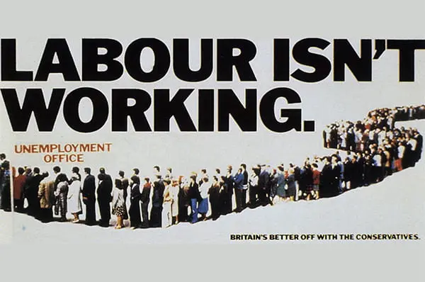
Designed by the powerful advertising agency Saatchi & Saatchi, the “Labour Isn’t Working” campaign ran in 1978 and 1979. The high unemployment rate in the UK was a major issue and the Conservative Party, led by Margaret Thatcher, wanted to attack the Labour Government on their handling of the crisis.
The poster depicts a long queue of unemployed people waiting for their appointment at the unemployment office to look for work and claim their benefits. The budget was tight for this production so that might explain the decision not to use an actual building to denote the office. However, the mental concept becomes more universal because the location could be anywhere in the UK.
Interestingly, on the day the photograph was supposed to be taken, the advertising agency hoped that one hundred volunteers from the Conservative Party would turn up for the photoshoot, but fewer than twenty young Tories showed any interest. The poster’s designer, Martin Walsh, marked the path out by using a rope and then photographed the same group of tightly huddled people at different points along the route. By superimposing the pictures on top of each other, he was able to give the impression that a large queue had formed outside the unemployment office.
Try to spot where the photograph ends and another begins.
The headline is a great pun, referring to both the high unemployment rate and the political party in charge of the country. The use of the full stop makes the statement seem more definitive. The tagline “Britain’s better off with the Conservatives” anchors our interpretation of the text.
The campaign was a tremendous success. In fact, after Thatcher was elected Prime Minister, the Tory party treasurer at the time claimed the posters had “won the election for the Conservatives”. Campaign, a magazine for business and marketing, voted the advertisement as the “Best Poster of the Century”.
Final Thoughts
The hypodermic needle theory describes a linear flow of information from the producers to the mass audience who simply accept the message because they are passive.
Perhaps most people will decode the preferred reading of the drink-driving campaigns. Our consumerist culture suggests advertisers have been successful in persuading the mass audience should keep buying whatever is on the shelves. Importantly, politicians know they do not need a uniform interpretation of their policies and propaganda. They just need the majority to agree with their message.
References
1 BBC News (2001): “’Epoch-making’ poster was clever fake”. Accessed http://news.bbc.co.uk/1/hi/uk/1222326.stm
2 The Guardian (1999): “Tory advert rated poster of the century”. Accessed https://www.theguardian.com/media/1999/oct/16/advertising.mondaymediasection
3 BBC News (2001)
4 ditto
Stay Tuned
Curious about how audiences respond to media texts? The following articles explore how we interact and interpret the media.


