Creating a Double-Page Spread
Use Photoshop to design a great looking layout in ten easy steps.
Introduction
Traditional print magazines have long production cycles and rely on physical distribution. The costs are substantial. By contrast, online publications provide immediate access to news and features to anyone around the world with a device connected to the internet. These digital formats tend to have fewer overheads as well.
It is no surprise print media struggled to adapt to changing consumer habits and remain profitable. Lots of mainstream titles shifted from physical copies to focus on their online presence, such as Teen Vogue. Some well-known titles were no longer viable and ended their production run.
Independent magazines are popular with readers because they offer unique perspectives or target niche audiences. They can prioritise high-quality design and deliver visually appealing content. For example, The Gentlewoman is curated by experts who give their community great insight into the fashion industry and the most important trends.
If you are interested in designing a double page spread or have an assignment to complete, this step-by-step guide will help you create following layout in Photoshop:

Once you become more proficient in using the Rectangle and Type Tools, you will be able to design your own unique spreads and get the top marks in your assignment. This tutorial will also develop your understanding of key terms used by editors and designers.
Contents
Step One – Creating a New Document
We are going to start with a blank canvas so choose your preferred method to open Photoshop’s New Document dialog box and select A3 from the Print presets.
Make sure the resolution is set to 300 pixels per inch before you close the Preset Details panel. This resolution is a common standard for print because it maintains the integrity and quality of your work – you don’t want your images and graphics to pixelate or your text to become unreadable.
We called our document “two page spread assignment”.

Once you press the “Create” button, the canvas will probably open in portrait mode. Go to the top menu bar, click “Image”, hover the cursor over “Image Rotation” and then select “90o clockwise”.
Step Two – Organise Your Workspace
The default workspace is probably crammed with lots of tabs we will not need for this tutorial. You can close the groups by going to the menu button ![]() at the top of panel and selecting “Close Tab Group”. If you close the Layers tab by accident, just click “Window” in the main menu and tick “Layers” or hold down the function button on your keyboard and press F7.
at the top of panel and selecting “Close Tab Group”. If you close the Layers tab by accident, just click “Window” in the main menu and tick “Layers” or hold down the function button on your keyboard and press F7.

We just want the Tools and Layers options. Inevitably, we are going to make mistakes so keep the History panel open as well.
Step Three – The Gutter
When you flick through a magazine, you will notice how the inner margins fold where the two pages meet at the binding. This space between the two facing pages is called the gutter. Since magazines are signifying processes and we want to create a positive reader experience, it is important not to lose content in the gutter.
Each page of our magazine will be A4 in size, but we are using the A3 preset to create both sides of the double-page spread. We need a guide to help locate the gutter and work out appropriate margins for our copy and images.
First, make sure your rulers are visible. Press Ctrl+R to toggle them on and off.
Then right-click on a ruler and select “Centimeters” to make it easier to define the gutter.

Press and hold the left mouse button over the side ruler and drag the thin line to the middle of the document. An X-value of 21cm should work.

If you need to move the guide, hover your cursor over the line, left-click and drag. To delete the guide, drag the line back to the ruler or select the line with the Move Tool and press the Delete key.
Step Four – Image Placeholders
We are going to add some rectangles to act as placeholders for images. If you read our Rectangle Tool tutorial and completed the tasks, you will already be familiar with its different functions.
Press the shortcut “U” on your keyboard or the rectangle icon ![]() from the toolbar.
from the toolbar.
Click and drag your mouse diagonally in any direction to create the rectangle. You should see the Properties Panel appear on the screen. Our shape defaulted to a black fill and 1px stroke. Click on the thumbnails if you want to change the colour or remove the stroke style.

We are bleeding the rectangle across the gutter because positioning the image on both pages is a good way of visually connecting the two spaces. Go ahead and add a couple more rectangles. The red rectangle in our example will act as the background for the sidebar.

Step Five – Add a Headline
Headlines are large, attention-grabbing text elements that should introduce the article and communicate its significance to the reader. To insert text, press the T button or select the icon from the toolbar. The ribbon at the top of the screen should change to the text options. We are going to use the Arial Black font – size 48pt and white:

Arial is a very accessible sans serif font. This size and weight should also make the headline stand out against the image.
Left click and drag the mouse close to our gutter guide to create an appropriate text layer. Your text layer will auto-populate with the “lorem ipsum” placeholder text.

This default setting can be incredibly annoying, but you can change it by clicking “Edit” and selecting “Preferences” and then “Type” at the bottom of the menu. When the new dialog box appears, untick the “Fill new type layers with placeholder text”. However, we are going to keep this setting to help create dummy copy for our subheadings and columns later in the tutorial.
What happens if your words are a horrible mess?

The spacing between the lines of text is called the lead. It defaulted to “Auto” in our example, but you might need to adjust your leading so the words are legible. Open up the Character tab for the different settings:

You can also adjust the tracking – the space between letters – and scale the letters along the vertical and horizontal axes. Play around with the settings and find a style that suits your product.
For more information on adding text to a Photoshop document, check out our introduction to the Type Tool. It takes a closer look at modifying text layers, including the various options in the Character panel.
Step Six – The Kicker
Subheadings provide additional information or context to the main headline and “kick” the reader into the main copy.
Left click beneath the main image and drag your mouse towards the gutter guide. We opted for Arial with the Narrow Bold weight and size 18pt, so the reader knows this copy is separate from the headline.

Step Seven – The Byline
The byline contains the name of the article’s author.
Click “T” on your keyboard to select the Type Tool and create a new text layer. We used Arial with a narrow weighting and size 9pt font. Try underlining your name to differentiate the byline from the kicker and main copy.
Step Eight – The Main Copy
We are going to add three columns of text to the verso (left page):

Once again, left click and drag the cursor to create a text layer. However, pay attention to the width and height values and aim for these dimensions: 6cm width x 11cm height.
Change the font weight to regular.
When you are satisfied with the text settings, make sure the layer is selected in the panel and then press Ctrl+C and Ctrl+V. We are duplicating the first column because we want the look of the main copy to be consistent. The space between the columns is called the alley. Again, make sure the space is even.
Step Nine – The Sidebar
The sidebar appears next to the main article on the spread and is added to develop a particular aspect of the story or offer an alternative perspective on the issue. It usually has its own headline and formatting.
First, we duplicated the headline from the main story and then adjusted the settings so both the font size and leading were 24pt. Making the text smaller and more compact should reflect the hierarchy of information on the double-page spread.
We also duplicated the kicker and changed the font colour to white, so it stood out against the red background.
Finally, we duplicated a text layer from the main article, changed the font to white and made the column 8cm wide to occupy the space more effectively. Here is the result:

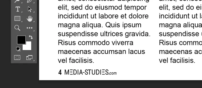
Step Ten – Adding the Folio
The folio can include the page number, magazine title, date, and issue name. Create yet another text layer and add the page number. We also added our branding:

Conclusion
If you are creating a double-page spread in response to a media brief, you will get marks for following the codes and conventions of the print industry. Attention to detail is crucial. That is why we duplicated the columns for a consistent look and added the folio to the bottom of the page.
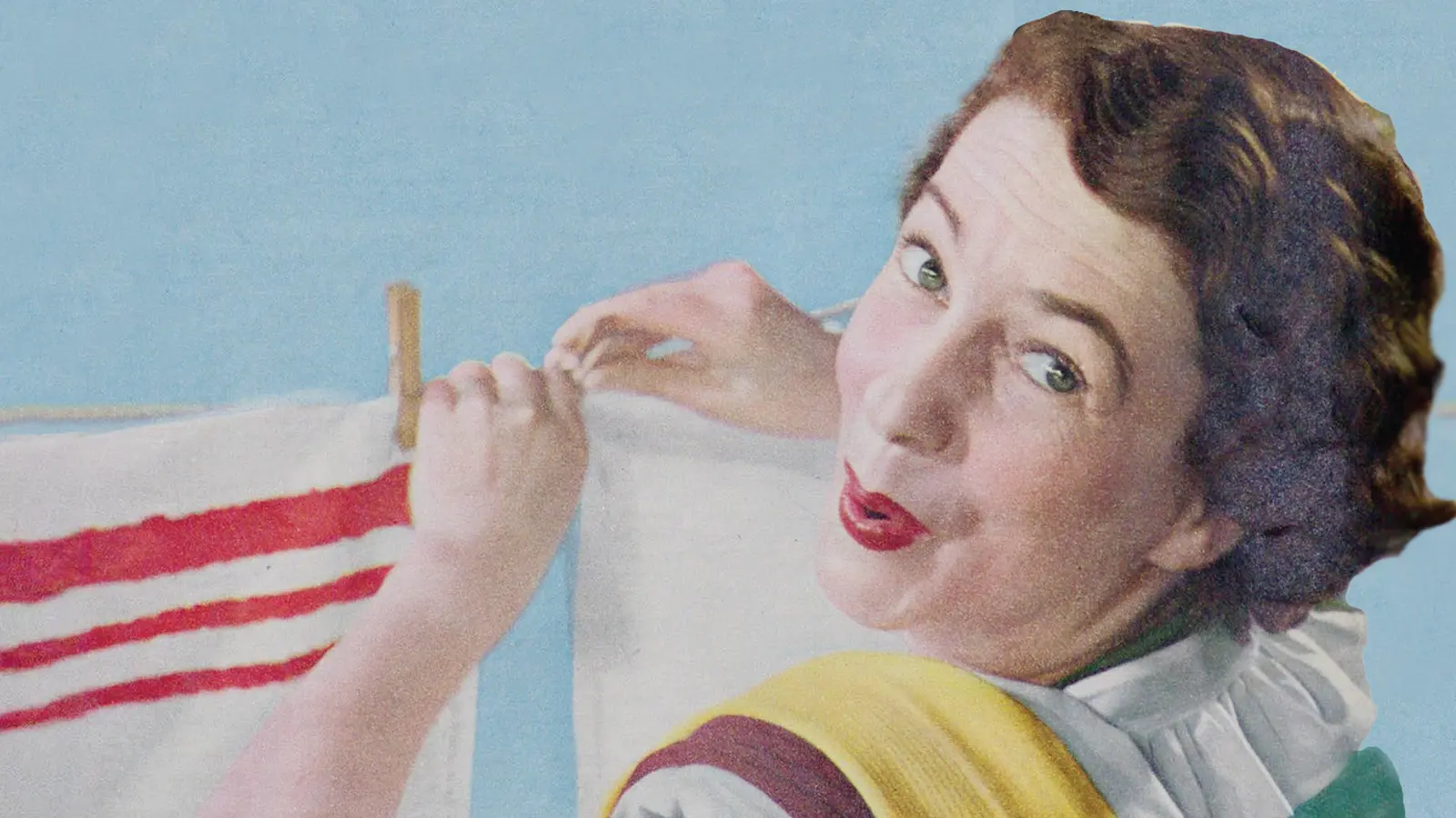
You could also use a dropcap at the start of the opening paragraph to signal where your article begins. Or a pull-quote to split the main copy and highlight an important aspect of the story. A caption might help anchor the reader’s interpretation of the second image.
You will probably need to create the front page as well so make sure you check out that guide.
For more practice making print products in Photoshop, follow our tutorial on creating a magazine cover or design the front cover for a media studies textbook in our introduction to combining shapes and text.


