Create a Movie Poster
Develop your technical proficiency in Photoshop in our step-by-step tutorial.
Introduction
The traditional movie poster continues to play a significant role in the marketing of new releases because the images are shared and circulated by users on social media to a wider audience. If the film is part of an established franchise, fans will log into forums and comment sections to discuss potential plot details and share their excitement.
Some movie posters can even become cultural icons. The official poster for Alien is instantly recognisable, Jaws provokes terror, and E.T. is mesmerising.
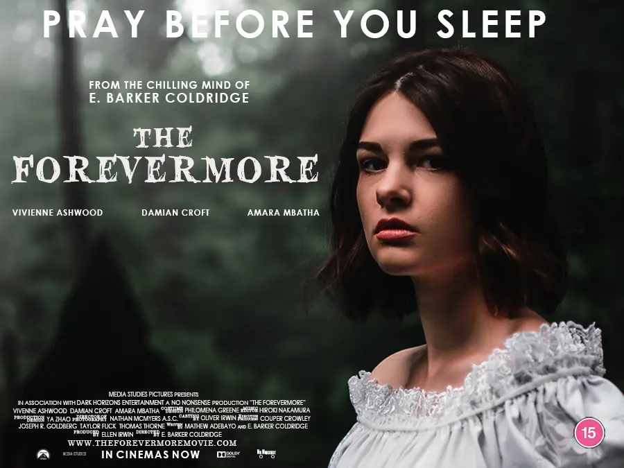
Our poster for a supernatural horror film called The Forevermore, will not be as spectacular as these terrific examples, but this tutorial will take you through some key processes in Photoshop.
You should already be familiar with how to navigate the workspace and use the type tool. The focus here is combining elements into a successful media product.
Contents
Step One – Create a New Document
Go to the top-left corner of Photoshop and click on “File” in the menu bar and select “New…” from the dropdown menu. You can also use the shortcut Ctrl+N on your keyboard. Both options will open the New Document dialog box.

Instead of using a preset, we need to add our own values to make sure our poster meets the industry standard and look great once it’s printed.
The most common format in the UK is the “broadside quad” which is 30 inches high by 40 inches wide. We are going to keep the ratio but change the units to centimetres because school computers are not always able to handle large file sizes and such a large canvas is not needed anyway.
After you add the dimensions, the landscape orientation icon should be highlighted blue.
This is a print product so you must use 300dpi for the resolution to avoid pixelation.
Select the CMYK color mode. This is the standard in the printing industry.
The other default settings should be fine.
Click the “Create” button.
Step Two – The Main Image
We are using an image from a Ukrainian photographer which features a hooded figure who is threatening our young protagonist. Her haunted facial expression and the forest setting increases that sense of vulnerability. The dress codes suggest the story takes place a century or two ago.
If you are searching for something to use for this tutorial, make sure the image scares the audience enough to spend their money at the box office. Distorted faces, menacing monsters, creepy dolls, and isolated places are typical signifiers of the horror genre. Unsplash has plenty of scary options for free.
There are different ways of inserting an image into the project. You could press “File” at the top of screen and then select “Open” from the dropdown menu. This will open your browser so you can search for the file on your computer.
We had the file saved in our Pictures folder:
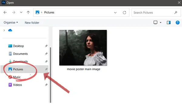
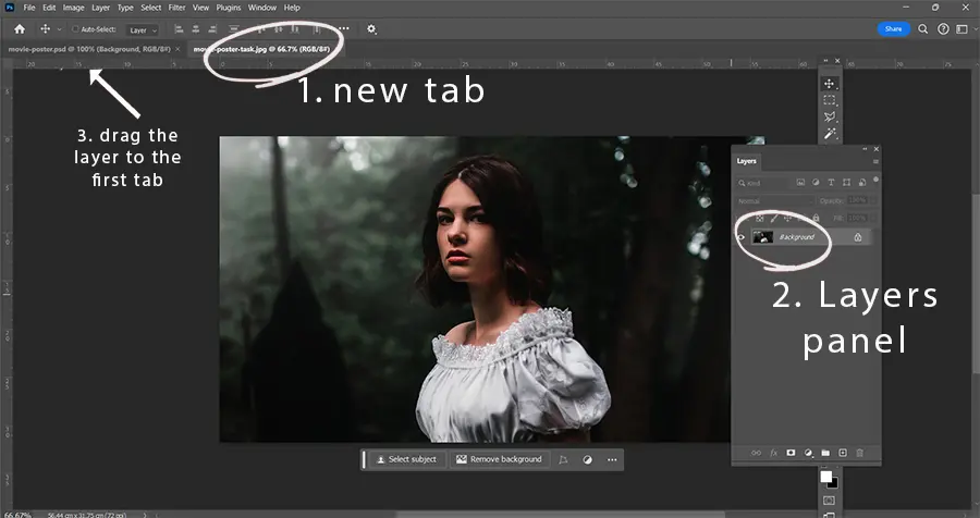
Once you have selected the file, a new tab will open in Photoshop.
You need to drag the image across into the canvas area of the first tab. Select the layer in the Layers panel.
Press and hold the left mouse button. When you move your cursor over the first tab at the top of the screen, Photoshop will switch to your main canvas, and you will be able to insert the image layer.
Of course, you could simply copy and paste your image into your work area if you are taking one from the internet, but make sure the image file is large to avoid a blurry finish.
Use the move tool ![]() to reposition the image on the canvas. The shortcut key is V. Transform if necessary – press Ctrl+T to start the tool.
to reposition the image on the canvas. The shortcut key is V. Transform if necessary – press Ctrl+T to start the tool.
Step Three – The Title
We wanted to reinforce the horror genre with a spooky font and picked Blood Crow Expanded from dafont.com.
First, select the Horizontal Type tool ![]() from the tool bar. The shortcut is T on your keyboard. Both methods will open the Control panel at the top of your screen.
from the tool bar. The shortcut is T on your keyboard. Both methods will open the Control panel at the top of your screen.
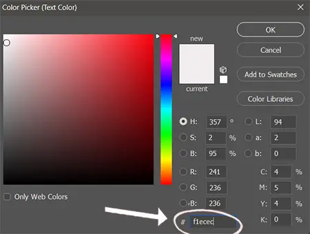
You will find your scary typeface in the drop-down menu or by typing its name into the box. We went for size 76pt font and a light grey with a hexadecimal value of #f1ecec.

Click the Text Color picker to open the dialog box. You can use the colour wheel or type in the value in the field at the bottom.
The next step is to create the text layer. Press and hold your left mouse button. Drag the cursor diagonally and release when you are satisfised the size of the box is appropriate for your title. We went for 20cm wide and 4cm high, but you will be able to judge the right dimensions for yourself.
Simply type “Forevermore”. Click the tick symbol at the top of the screen and you are done.
For “The”, we created another text layer and changed the font size to 57pt.
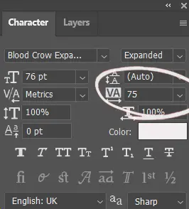
We also adjusted the tracking to 75 so the letters in both text layers are presented further apart. To adjust the space between letters in your own document, go to Window in the main menu at the top of the screen and select Character.
The Character panel will now appear in your tab group. Type 75 into the VA field or select the value from the dropdown menu.
Step Four – A Tidy Layers Panel
Media products contain lots of elements, so it is important to keep your Layers panel organised.
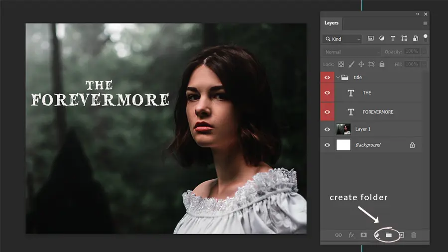
Select the folder icon ![]() to create a new group. Double click on “group 1” and rename it “title” to reflect its content. Press Enter to confirm the change.
to create a new group. Double click on “group 1” and rename it “title” to reflect its content. Press Enter to confirm the change.
We also assigned the red colour to the group. Right-click the layer, hover your cursor over “Color” at the bottom of the list and then pick a colour.
Drag and drop your two text layers into the group.
This means we can now move both elements of the title around the canvas when the group layer is selected. It should also make it easier to locate the two layers in the title when the document becomes more complex.
Step Five – Cast and Crew
We are going to add the names of director and the stars of the film around the title. You can copy our names in your own project or add the names of your friends and family.
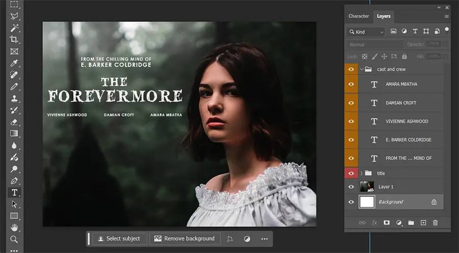
Create a new group and change the name to “cast and crew”. Change the colour to orange to differentiate the group from the title layers.
Select the Type tool ![]() .
.
We picked a typeface called Century Gothic because its tall lower-case characters are perfect for headings in large print products. Then we changed the weight to bold, the size to 24pt, and the tracking to 75.
Type “E. Barker Coldridge”.
Create another text layer and change the font size to 20pt.
Taking advantage of the star power of the director to appeal to the audience, we added “from the chilling mind of” above their name. Trying using the tracking function to make sure the line matches the width of the director’s name.
We just changed the font size to 15pt for the names of the three actors. We also made sure their names aligned with the title and were evenly spaced.
Step Six – Tagline
A tagline is an important part of a film’s branding and is often used across all marketing materials. Hopefully, our tagline “pray before you sleep” reinforces the genre and sets expectations about the emotional experience audiences can expect when they watch the film.
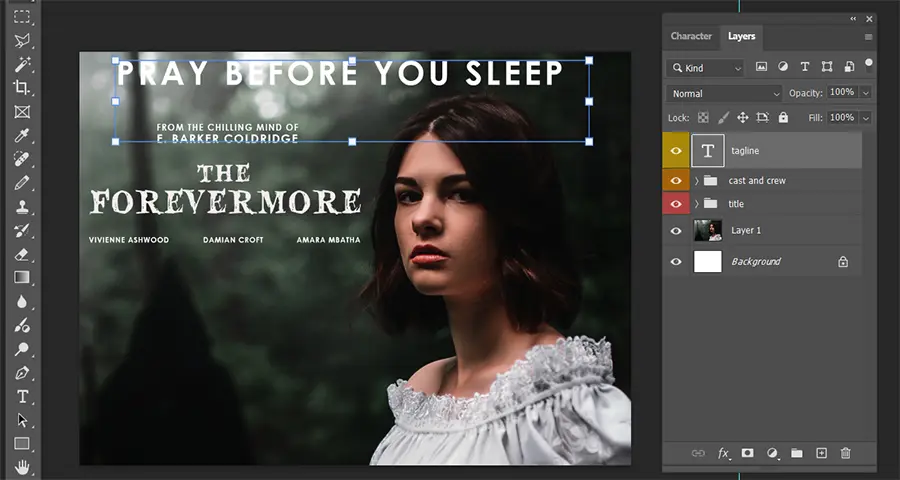
We used Century Gothic again to keep the look consistent. 68pt font size and tracking set to 100 this time.
The name of the layer in the Layers panel defaulted to the text we typed. We renamed it to “tagline” and changed the colour to yellow to make the tagline easier to find.
Step Seven – The Billing Block
The billing block is another convention we must add to our official poster for The Forevermore. It is a list of the “above the line” cast, crew and companies responsible for the creative direction and production of the film. Who is included in the billing block is determined by industry regulations and contractual agreements, but you can expect to see credits for the producers, director, cinematography and designers.
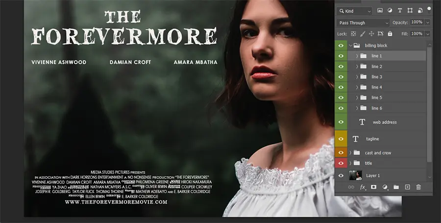
Sticking with Century Gothic and the regular weight, we used size 10pt font for the names and then 7pt for the roles. Tighten the letters compared to the previous text layers by setting the tracking to zero.
The names are often scaled vertically. To achieve this look, select the Character panel and change the value to 120% – ![]()
Try to keep the lines of the billing block centred.
If you are struggling to think of names and roles, search for any film on imdb.com and look at the complete list of cast and crew for inspiration.
Step Eight – Web Address and Release Date
Create another text layer below the last line of the billing block – Century Gothic with size 14pt font. Type in “www.theforevermoremovie.com”.
We used the convention “In Cinemas Now”. Go with a bold weight and size 20pt font this time in the final text layer.
Step Nine – Industry Logos
You can copy and paste real logos, such as the Dolby Digital logo, or create your own.
An effective logo will reinforce the brand’s identity and values, so think carefully about which fonts you will use in these layers. Add a symbol or icon that will also resonate with the audience.
Final Thoughts
There are different types of movie posters, such the teaser posters released months before a film’s debut, character posters, and limited-edition versions for fans to collect. This tutorial focused on the official theatrical poster which is often the most comprehensive version used for marketing.
You could adapt the poster for inclusion in a film festival by adding or highlight its critical appeal after the film has won prestigious awards and received great reviews. The purpose and intended audience will influence how the elements are arranged.
If you want a quick exercise to reinforce your ability to combine image and text layers, work through our guide to creating an album cover. For more practice designing other print products, try our tutorials on creating a newspaper front page and a double-page magazine spread.

